LingGo
Promoting language learners to find their own learning style and discover their community

Everyone learns in their own unique ways, with immersion and experience being the biggest factors in language acquisition (BigThink). Unfortunately, many language learning apps either do a rounded approach or hone in on a specific method of learning and doesn’t necessarily give learners the opportunity to apply their language while learning it.
Problem
Along with tried and true tested learning modules (why break the wheel when you can reinvent it), LingGo offers a unique addition to find events in local metropolitan areas that allow learners to apply their learnings to a given real life scenario. Along with that, they get the opportunity to connect with other learners to build community together, encouraging each other to engage with the language together.
Solution
Target Audience
Language learners looking to optimize/customize their learning experience for community and immersion.
Roles
UX Research, UI Design, Branding, Prototyping, User Testing
Project Duration
January ‘24 - June ‘24
Platform
Tools Used
Figma, Google Forms, Maze
Mobile App
Conducting Research
Research Goal
I wanted to understand what keeps language learners engaged with their language learning journey.
I conducted user interviews on Zoom and uncovered important insights about user habits and their frustrations. These were synthesized into an affinity map that allowed me to see the common themes that ran through the interview. Here were my insights:
All language learners required a form of immersion or interest in the culture to maintain their learning habits.
Four learners struggle with understanding their target language in its context, and often felt like things were getting lost in translation.
Four learners found it hard to find engaging media to stay engaged and enjoy in their target language.
There was no consistent “language learning method” that applied to any one person. Everyone required a combination of different learning tactics.
User Interviews
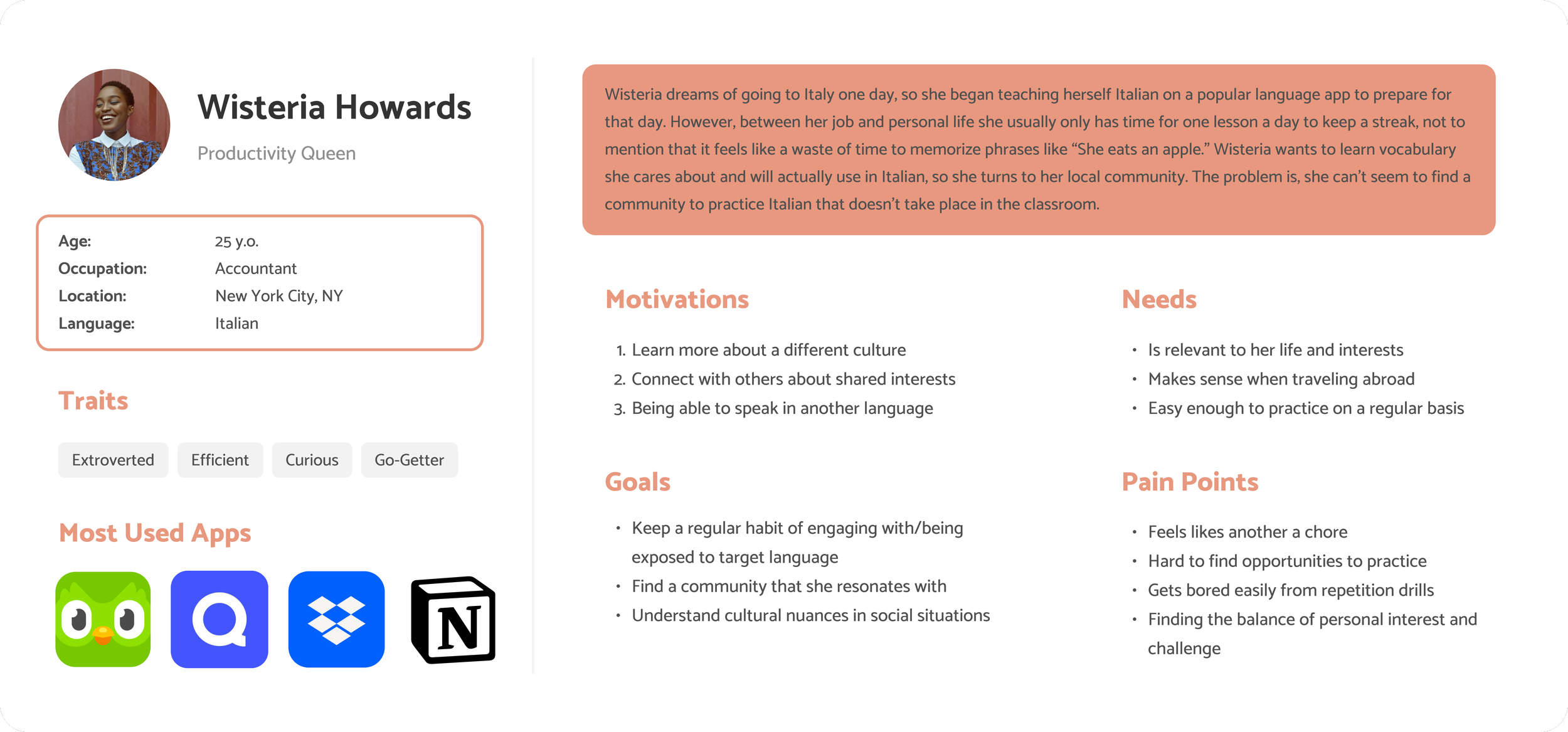
Wisteria represents learners who are beginning their language journey because of interest travel and another culture. She wants to be able to communicate with others and expand how she looks at the world.
With the repetition of apps, she’s having a hard time staying motivated and feeling like she is actually learning vocabulary that is applicable to her.
Meet Wisteria
With Wisteria, I wanted to solve this problem:
Young adults learning a language need solutions that seamlessly blend engaging and immersive learning experiences into their busy lives, so that they can maintain a regular routine and feel confident applying it.
After going through the process, I landed on two main ideas:
Ideation
While the one on the left was practical, it could have easily been covered by other programs that already exist. The right one provided something that potentially didn’t exist yet and seemed like an interesting idea to explore.
Key Features for Minimum Viable Product (MVP)
Keeping in mind all the synthesized data from the user interviews, I compiled a list of 4 key features that would be required for this app that would be titled LingGo:
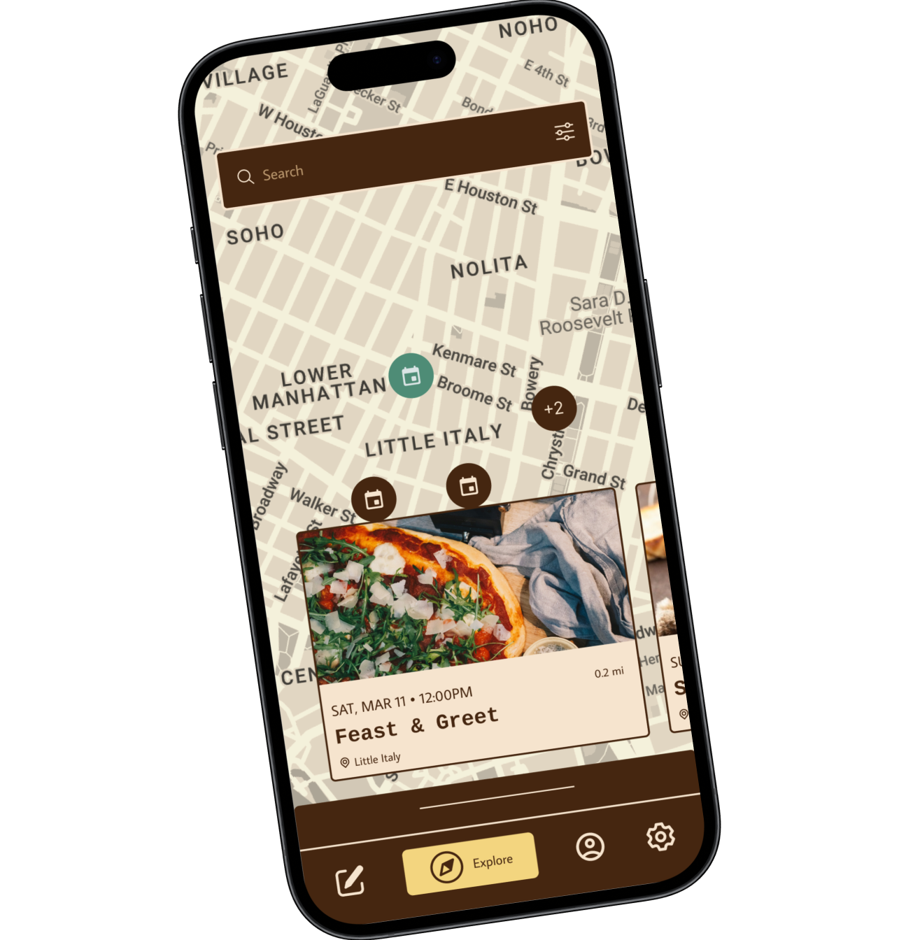
Discover cultural/practice events in local area
Lesson plans recommended prior to attending local events
Flexibility of lesson plans catered to the users’ learning style (speak, listen, write, read, etc.)
Recommendations of short stories and videos from external sources (such as Youtube) to further explore cultural topics
Based on the four key features, I created a sitemap that included two main pages:
Explore: search up events and activities to do in the area
Practice: practice and maintain target language just for fun or prior to an event
Sitemap
After drafting the overall layout of the app with the key features in it, I began visualizing low-fidelity and mid-fidelity wireframes.
Sketches to Wireframes
At this point I had some design opinions that I wanted answered before moving on to the final product. I covered this through A/B and usability tests on Google Forms and Maze.
Testing and Iterating
A/B Testing
A quick A/B Testing helped me determine which designs were the most intuitive according to 10 users, as well as provided them an opportunity to ask and question design choices that might not have made sense at first glance.
60% of users opted for Option A, with key points being that it was much easier to swipe and see the lessons at a glance. For many people, opening and closing lessons didn’t seem very appealing.
80% of users opted for Option A, with users saying that they would prefer to be able to see the thumbnail of videos and short stories rather than clicking into another page in order to do so.
Usability Testing
With A/B Testing completed, I set out to prototype and test my wireframes. I recruited 7 participants and conducted usability testing in order to see how users would interact with the product and discover where improvements could be made.
Tasks
Sign up and onboarding screens to create an account
Starting and completing a lesson for practice
Navigate, search, and sign up for a language event in the area
Wins
The usability testing was pretty good with a success rate of 87%. For the most part, people loved the concept and found the app to be intuitive and easy to navigate.
Comprehensive Usability Testing Report
Iteration
The most pain points that occurred were the designs from the practice flow. Many people had confusion about what the next step was or what they were supposed to do.
“I think there could have been clearer instructions about what to do/prefaces for what the next page will be.” - Participant 3
Before
After
Instead of swiping, chapters are placed into a clear drop down, while the lessons are clearly displayed. Upon clicking them, CTAs (Call to Actions) are clearly labeled in order to prompt the user to the next step.
“I wasn't sure if the icons under the video… were what I was supposed to click on next to progress the lesson.” - Participant 1
“…when opening the lesson it was unclear if the play button correlated to the transcript as an overview or the lesson itself.” - Participant 2
Before
After
In practice, users were overwhelmed by the options in the lesson screen and weren’t sure how to continue. Instead of laying out all the options, users are now funneled into the listening portion of the lesson, with additional practice prompts available at the end of the lesson for supplementary practice if they so choose.
“It was unclear if the user's dialogue part is given to the user to read/say out loud, or if it's capturing what the user is speaking into the app.” - Participant 7
“The only feature I was looking for was a way to hear to correct pronunciation. E.g. If I didn't know how to correctly say Bruschetta, is there a way I could hear [how it’s] pronounced” - Participant 4
Before
After
Clear CTAs were added to distinguish the user action. If users dont know a word, they’re able to click on the audio button to listen to the dialogue. The waiter’s text bubbles are now in English to account for the learning level of the user (who is a beginner).
Branding
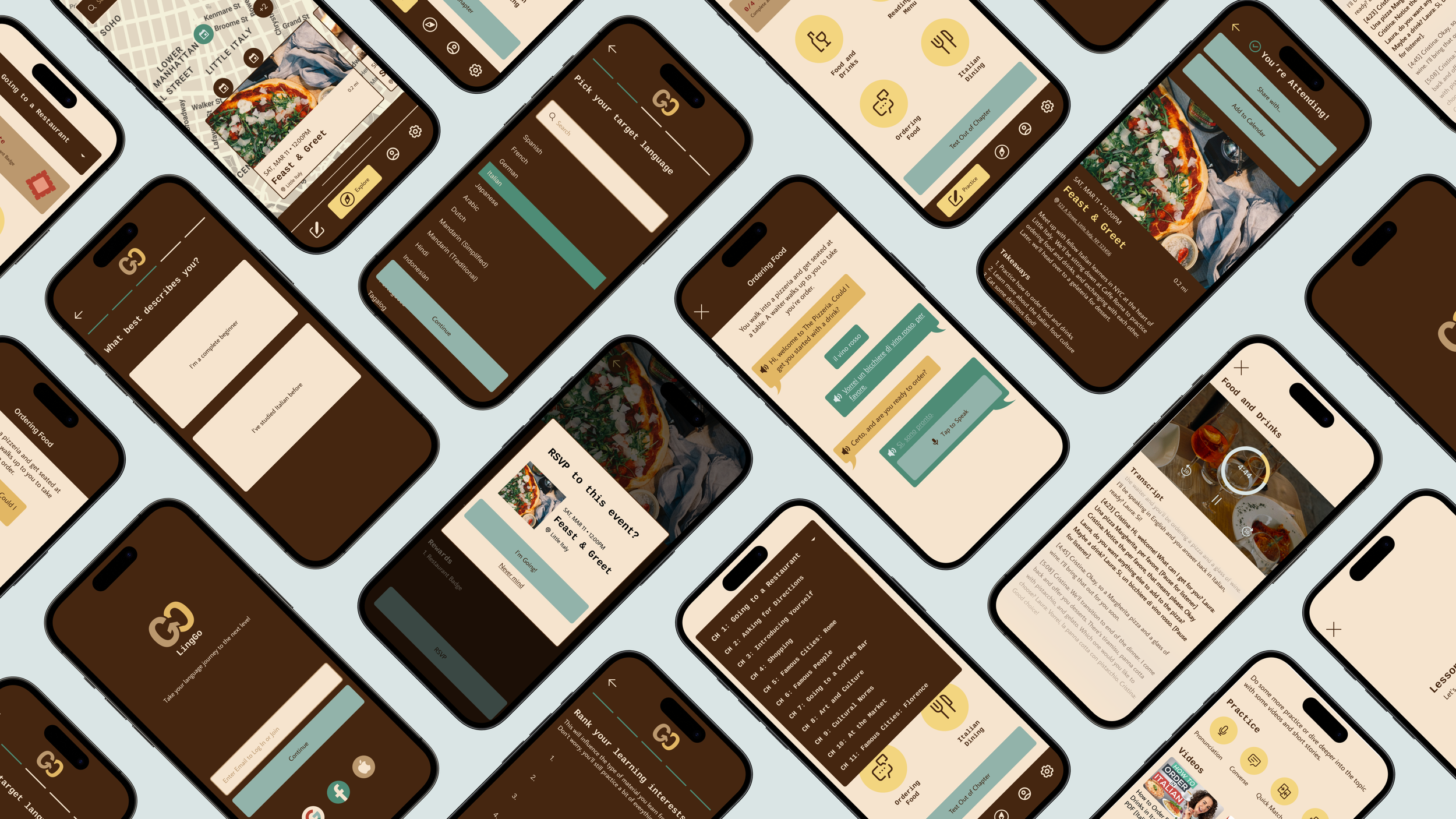
There’s already a bit of the sneak peak from the iterations above, but I wanted to make LingGo feel like a place for exploration, knowledge, and diversity. Inspired about postage and national parks for their exploration, I leaned in on neutral browns, using muted blues, reds, and yellows to bring variety and showcase some of the most common flag colors.
Final Prototype

One takeaway I learned from this process was the importance of user interviews and user testing. As an avid language learner myself, I walked into this project with ideas that would benefit me as the user, and without the research phase, I would not have gotten a wider range of concerns that other people had about language learning. Throughout the process, I also learned the importance of organizing my research documents, assets, and progress. This helped me so much to refer back to my previous information and continue to make research-informed decisions that were easily accessible especially in the later stages of the process.
Reflection
Because my user testing took place before the final prototype, I would love to do another round of user testing to prove that there has been an improvement in the practice flow. Additionally, I would love to expand upon the events/community aspect of the app. It would be really interesting to incorporate third-party services (why break the wheel when you can just reinvent it) such as Google Calendar, Eventbrite, and others just to make attending an event much easier and even accessible for a larger audience who may not necessarily use the app.


