
LMNL Space Website
Building a website for a creative space, whose purpose is to form communities that foster collaboration across different modes of expression.
LMNL Space (pronounced liminal), a local multipurpose creative studio with endless opportunities, is looking to create a website that aligns with their mission to provide a safe space for everyone of diverse backgrounds to create and express their most authentic selves.
Problem
Build a responsive mobile/desktop website that embodies their current brand identity and clearly defines what their business provides in order to create an online presence.
Solution
Target Audience
Artists in their 20s living in the Greater Los Angeles area who want to improve their craft.
Project Duration
Roles
UX Research, UI Design, Prototyping, User Testing
September ‘23 - December ‘23
Desktop, Mobile
Tools Used
Figma, Square Space
Platform
Conducting Research
Research Goal
I wanted to understand what the audience thought of LMNL Space (what it provides, how it makes them feel, and what they’re frustrated by), compare that with what the goals of the space are, and find a solution that fills the needs of the community it serves.
Competitive Analysis
I conducted a competitive analysis on four potential competitors in order to get a better understanding of the expectations that would come from a creative space like LMNL. We found that there’s not one company that fully provides the services that LMNL Space does, and that the new website can do well with some defining of brand goals and information architecture.

Stakeholder Interview
The stakeholder interview was particularly important because I allowed me to challenge any preconceived notions I had about LMNL Space. As a previous intern, I was already well-acquainted with the space, but sitting down with the owners to talk about their goals, frustrations, and expectations led to a deeper understanding of their intentions and the role the website played. Through our interview, we narrowed down on three objectives:


Information Architecture
Point of Contact

Brand Presentation
The owners had lots of amazing ideas about building a community, providing a space of endless possibilities, and fostering a creative environment. We strategized to align the website’s design and their vision. This involved making LMNL Space accessible, outlining their services comprehensively, and effectively conveying the essence of the space.
Gathering Data
I also wanted to get an idea of what people thought of LMNL Space, and whether or not that aligns with the goals of the owners.
For detailed insight, I interviewed 5 participants, 4 of whom have used the space for classes, events, and rentals (to varying degrees and use cases), and 1 that knew of the space from social media and was a likely candidate to engage with the space.


3/5 expected a way to contact the studio
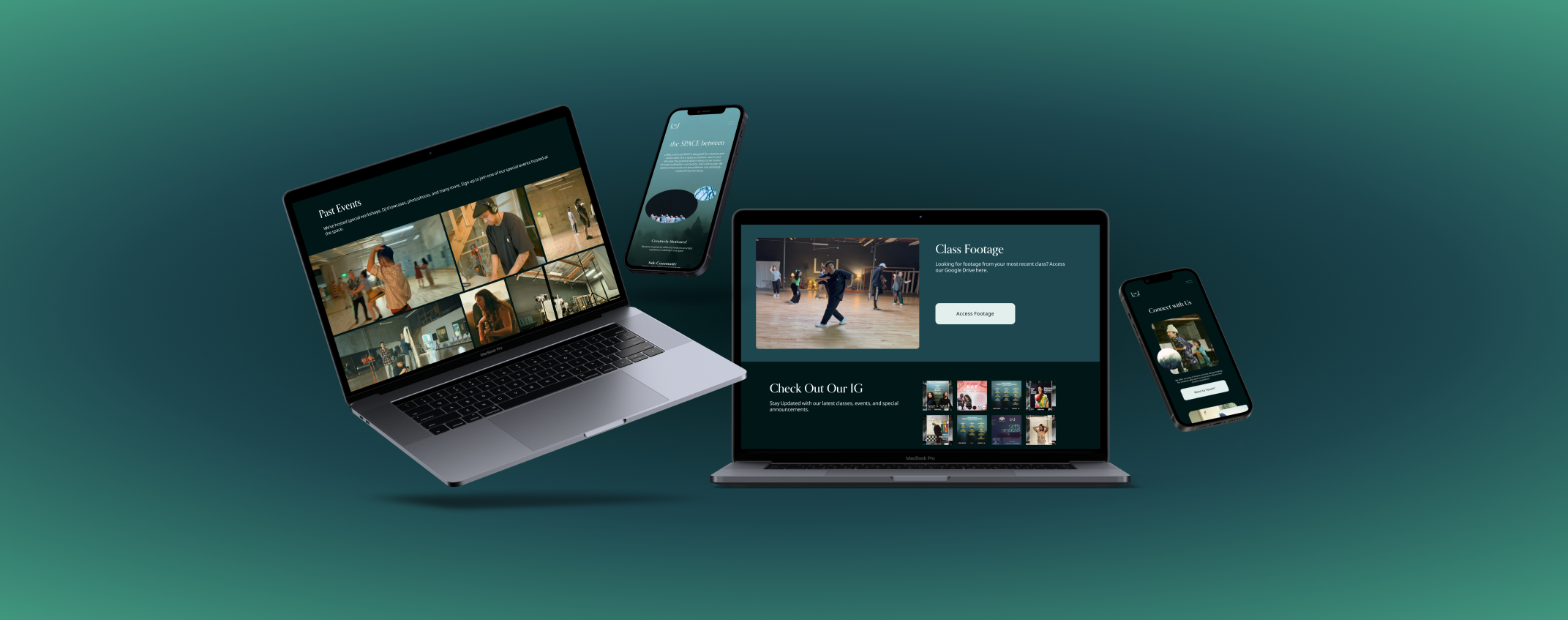
5/5 wanted to see footage of the space in use

5/5 wanted more clarity of calendar
For quantitative insight, I set up a survey to be put on LMNL Space’s Instagram for them to answer questions on how satisfied they were on various aspects of the space. There were a total of 32 total responses over the course of 5 days.


3 themes that described the space were
Community, Creative, and Authentic
21 surveyors (65.6%) rated their experience at LMNL Space a 5 out of 5

16 surveyors (50%) of the participants knew that LMNL Space had a website
These insights reaffirmed our decision to focus on point of contact, information architecture, and brand presentation in order to improve the experiences of the users’ relationship with LMNL Space’s virtual ecosystem. We wanted to ensure that potential users would get a good understanding of what the space was like and what it was used for, what values the space reflects, as well as emphasizing consistency and clarity for the services offered.
Meet Jeanie and PJ
Two personas were created with the intent to encompass the variety of creative mediums, expression, and expertise of the people that would enter the space.
As a young aspiring dancer, Jeanie would primarily be seeking class opportunities, private rentals, and the occasional dance-related event as part of her training.

As for PJ, who’s goal is to eventually turn DJ and event-planning into his full time career, he primarily cares about coordinating with owners to rent out and host his own events.

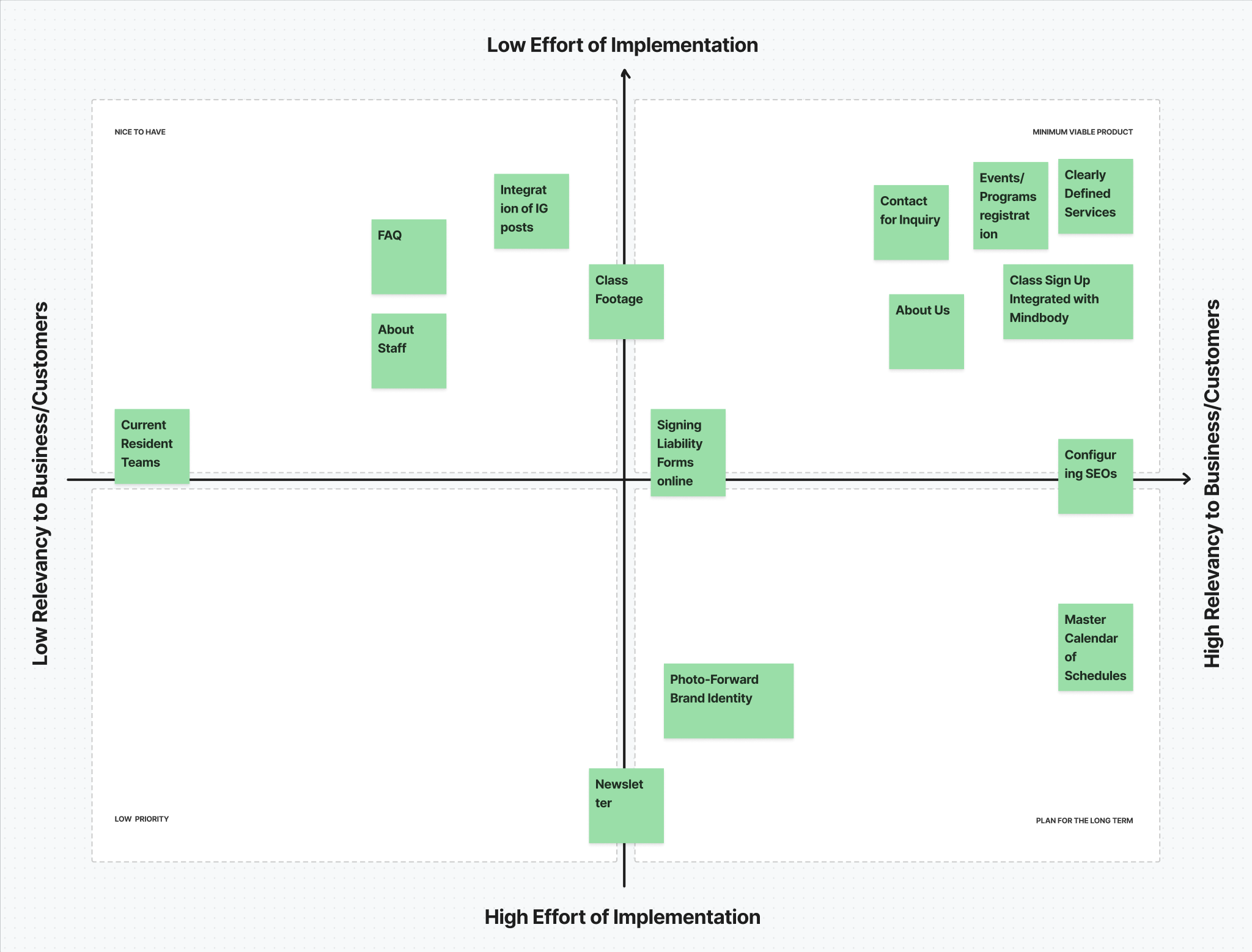
Feature Prioritization
In order to narrow down the scope, I listed out all the possible features and sorted them into an Impact/Effort Matrix. With the owners, we went through several ideas of what they were looking for in the website, keeping the initial goals in mind. We settled on moving forward with a website that meets what is absolutely necessary for the space, such as signing up for classes, accessing service information, and directly contacting the space, saving other ideas for future iterations of the website.
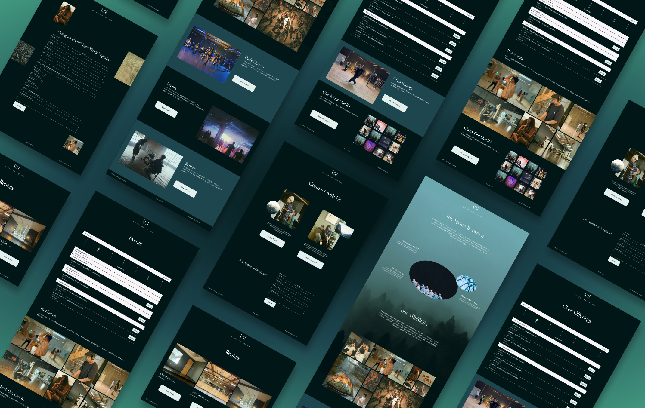
Sitemap

The sitemap served as a roadmap to assess where all the features were going to be placed as well as figure out the information architecture that suited the needs of both the users and the owners.
We separated classes, events, and rentals into three separate pages, each with functions that are specific to their own needs. The ‘About Us’ would explain the space in depth, and if possible, the pages with asterisks would be added in if assets are available near the completion of the project. Lastly, there was a separate contact page that allowed users to inquire about different aspects of the space.
Ideation
Sketches
I sketched multiple iterations of what each page would look like, offering different ways of displaying information.

Mi-Fi Wireframes
What resulted from the sketches were a combination of features from different sketches that my owners and I thought worked best together. The mid-fi wireframes helped actualize, in the simplest way, the dimensions and functionality of what we had envisioned.

UI Design
Using aspects of the existing logo and values in mind, we focused on a style that was comforting yet mysterious— inviting the user to explore more. The design was also inspired by the physical space itself, which exudes a mysterious, whimsical, warm, and comforting space in itself. It was, apart from the owners themselves, what participants referred to when they thought the space was warm and comforting.

Making Adjustments
Realities of Working with a Client
Learning to work with what I have and letting go of what is out of my control has been a valuable part of this process. No matter how transparent I am and how much I do my best to communicate, unexpected circumstances will always arise. With that said, moving forward, the following information and assets are fabricated by me for the purposes of the case study only.
Iterations
While the original buttons served well as accent colors and passed accessibility tests, the white popped out more and gave more area to click. I also adjusted the corner radius to be more square to match the photos, which also have rounded corners.


The original layout for the rentals consisted of a Mindbody app-integration at the top that would allow the user to sign up for a room with descriptions of each room underneath it, but that integration was:
1. Uncertain to work properly (I had no access and so I wasn’t sure about the likelihood of being able to book a room)
2. Relatively unintuitive, with 2 of the 5 interviewed disliking the process of booking a room.
In order to alleviate the hardship of selecting a space, figuring out which space that was, what the price is, and what dates it was available, I put the name, cost, and size together in one page along with a visual reference so user know which room they’re selecting, and once they click on it, they’ll then go through the rest of the Mindbody experience to select the date to complete their booking.


Reflection
My huge takeaway from working with LMNL Space has been balancing flexibility in scheduling while still meeting goals. This project has been very insightful in terms of planning and communicating timelines, expectations, and progress. I found that working with others really motivated me and allowed me to become invested in what their business was about, which made the overall project that much more exciting. Working with others created a different dynamic compared to working by myself , and while I had times where I took charge in my own process, I found that getting insight and being able to ask for feedback from the people who the product was being built for to be a humbling and gratifying experience.
Next Steps
This project is far from over! Like I mentioned briefly, life happens and I had to continue the project without the owners, but we are still coming back together to finish the project. My next steps would be to help launch the website and do live-website usability tests and make reiterations. I would also love to get an ‘About’ page up and running as well to further exemplify the space that LMNL provides.